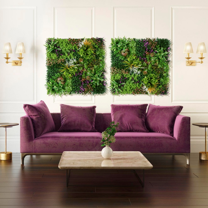
Color matching is the core of the visual effect of a vertical garden, which needs to take into account the growth characteristics of plants, the sense of spatial layering, and the psychological feelings of viewers. The following analysis is carried out from four dimensions: design principles, color combination, seasonal changes and ecological coordination:
Application of Color Psychology
Cool tones dominant (blue, green, purple) : Suitable for Spaces that need to create a serene atmosphere (such as office areas, hospitals), for example, plants like blue snowflake, lavender, and hosta can be chosen.
Warm-toned accents (red, orange, yellow) : used to activate the visual focus, but the proportion should be controlled (not exceeding 20% of the total area), such as adding a few petunias or geraniums.
Spatial scale adaptation
Small-area gardens: Predominantly use a single color or adjacent colors (such as all green with a small amount of white) to avoid visual clutter.
Large gardens: You can try contrasting color combinations (such as red and green, yellow and purple), but the sense of conflict should be weakened by the height or density of the plants.
Monochromatic gradient
Transition from light green to dark green: Plant Sedum sinensis at the bottom layer (light green), pair it with vitriol in the middle layer (grayish green), and choose turtle-back bamboo at the top layer (dark green) to create a sense of layering.
Single flower color gradient: For instance, the pink series transitions from light pink (petunia) to deep pink (hydrangea), achieving color flow through flowering period control.
Adjacent color matching
Blue and purple tones: Jacaranda (upper layer) + Libelia (middle layer) + iris (lower layer), creating an elegant atmosphere.
Yellowish-green series: Golden Leaf Yellow (hanging) + Golden Chrysanthemum (middle layer) + Green Vine (upper layer), suitable for areas with abundant sunlight.
Contrasting colors add the finishing touch
Red and green combination: Use green as the main background (such as ivy), with red plants (such as banana trees and poinsettias) as accents. The recommended ratio is 7:3.
Yellow and purple combination: Yellow pansies and purple sage are alternately planted to create a sense of contrast, but large-scale direct collisions should be avoided.
Distinct four Seasons design
Spring: Predominantly pink and white (cherry blossoms, tulips), with a small amount of yellow (forsythia) as accents.
Summer: Emphasize cool tones (blue snowflake, hydrangea) to lower the visual temperature.
Autumn: Introduce orange and red (maple trees, nandina domestica) to echo the natural colors.
Winter: Retain evergreen plants (pine, cypress, Holly), and partially decorate with fruiting plants (firethorn, nandina domestica).
Flowering period control techniques
Extend the flowering period through plant combinations: For instance, connect bulbous plants (hyacinths) in early spring with perennial flowers (irises) in late spring to avoid color discontinuity.
Use foliage plants to fill the gaps: for instance, heum and coleus provide color support during non-flowering periods.
Plant habits priority
Avoid interplanting shade-loving plants (Hosta) with sun-loving plants (sunflower), as even if the colors are harmonious, it may still lead to poor growth in one area.
Combining the shade-tolerant silver-leaf chrysanthemum with the semi-shade-loving heum root not only meets the color requirements but also conforms to the ecological conditions.
The combination of color and function
Insect repellent function: When paired with silver-gray plants (such as silver-leaf chrysanthemums and water hyacinth), the reflective properties are utilized to reduce aphids while providing a cool tone for embellishment.
Aromatic function: Plant vanilla plants (mint, rosemary) in warm-colored areas to enhance the experience through the interaction of smell and vision.
Dynamic color adjustment
Reserve replaceable areas: For instance, set up movable planting troughs at the edge of vertical gardens to quickly replace plants according to seasonal or activity requirements (such as adding red flowers during festivals).
Pruning controls the proportion of colors: By pruning, the growth of certain plants is inhibited to maintain the overall color balance.
Excessive pursuit of color saturation
Error: The extensive use of highly saturated colors (such as all red or all yellow) can easily lead to visual fatigue.
Correction: Use green plants (accounting for more than 50%) as the base and high-saturation colors as accents.
Ignore the color transition
Error: Warm and cool colors are directly spliced without buffering.
Correction: Insert neutral color plants (such as white buttercups) or gradient color plants (such as petunias ranging from pink to red) between contrasting colors.
Ignore the influence of light
Error: Planting red plants that require strong light (such as Salvia splendens) on the shady side leads to a dull color.
Correction: Select plants based on light conditions. On the shady side, give priority to using shade-tolerant white or light-colored plants (such as hosta and white palm).
Through the above techniques, 3D artificial vertical gardens can achieve long-term color stability and dynamic changes, meeting ecological requirements while also becoming the visual focus in the space. When designing, it is necessary to flexibly adjust the color ratio and combination method in combination with the characteristics of the site, the characteristics of the plants and the usage scenarios.

Contact: Amy
Phone: 86-15311787313
E-mail: info@foszmac.com
Whatsapp:86-15311787313
Add: Fengtai District, Dacheng Road, No.24 Building, Room 203, Beijing, China